
 by
by A payment checkout page is a page that’s used to collect payments for products or services. Once the customer provides their credentials, they’re taken to an order confirmation page where they can confirm their purchase and finalize their order. A payment checkout page is a shopping cart checkout or checkout. While a payment checkout page is necessary for collecting customers’ payment details, it should also include all other essential elements of a checkout process. This consists of an order confirmation page where customers can review their order details and complete their purchase and order tracking page where customers can see when their order has been shipped and track its delivery status.
How is a payment page designed?
- When designing a payment page, there are many things that you need to keep in mind. The first one is the logo and colour scheme. A good logo will help convey trust and authenticity, while a bad logo can be quite off-putting. The colour scheme is also important. It can significantly impact how your customers perceive your brand, so matching the tone and style with your overall brand identity is important. Once you have decided on the payment method and the type of product or service to be sold, it is time to start thinking about what kind of brand image you want to convey. The main thing is to keep it simple and easy to understand.
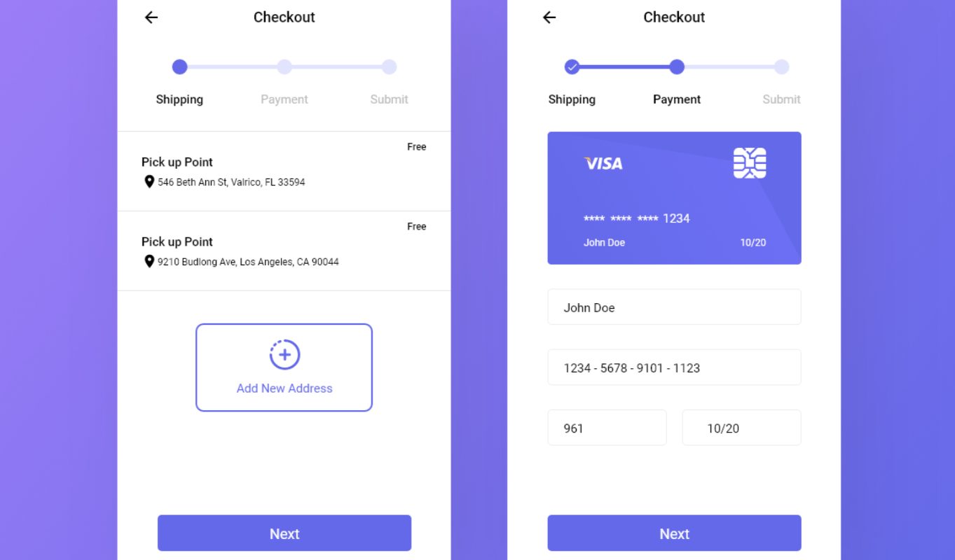
- Shopping cart details are an essential structure of the payment page as it is where customers can enter their credit card details. It is also where a customer may set up an account and make future purchases. There are two main types of shopping carts; the first being for online payments and the second being for offline payments. Third-party sellers usually host online payment shopping carts. Merchants themselves usually host offline payment shopping carts. The content within this section should be clear and explanatory so that customers can understand how to use the cart and process payments easily. It should also include all possible security steps to prevent fraud from occurring. Shopping cart details can be divided into many parts. It can be divided into what is visible on the frontend, such as name, logo, homepage URL, etc., and what is hidden on the backend, such as analytics data, payment method, etc.
- Shipping details are a crucial part of an ecommerce payment checkout page because it provides the customer with necessary information regarding their order’s delivery time, costs, and other essential details. This information can be displayed in several ways, including a table or list, an image, or a single text field. As the buyer’s shipping information can be used to identify their location and determine the best way to ship their order, it must be presented honestly and straightforwardly. On the other end of the spectrum, sellers should also be aware of legal restrictions on shipping times. For example, if a seller ships items faster than allowed by law, they could be subject to fines or penalties for breaking the rules.
- The payment method is how a customer pays for an ecommerce product or service. There are many ways to pay online, including credit cards, payment gateways, bank transfers,wallets etc. There are different payment methods, such as direct debit, payment via bank account, credit cards, and others. The type of payment method depends on the kind of ecommerce business. Direct debit is used when customers pay directly from their bank accounts. A credit card is used when customers buy using their credit cards. Bank transfer is used when customers send money to the ecommerce business. Online store managers should choose the payment method that suits their business model. For example, a store that accepts credit cards and bank transfers is better than one that only accepts bank transfers.
- A mobile-friendly design is an essential structure for a payment page for an ecommerce business. When a customer is browsing the ecommerce websites, the mobile-friendly design helps him navigate the site easily and quickly. The payment page interface should be easy and simple for customers to understand. It should provide clear indications on how to pay for shopping. In addition, the payment page should be compatible with all devices, such as smartphones and tablets. By using a mobile-friendly design, customers will have a better shopping experience. They are more likely to return to the website, which will increase sales revenue. Therefore, paying attention to the user experience when designing payment pages is necessary.
Summary – Nimbbl has the best payment checkout page design, combining form, text, and image with a one-click checkout flow. The design is simple, easy to understand, and sure to encourage conversions. The Nimbbl checkout page design makes it easy for visitors to complete their purchases through a seamless experience.